A Conceptual Introduction to PCA
David T. Harvey1
Bryan A. Hanson2
2024-04-26
Source:vignettes/Vig_02_Conceptual_Intro_PCA.Rmd
Vig_02_Conceptual_Intro_PCA.RmdThis vignette is based upon LearnPCA version 0.3.4.
LearnPCA provides the following vignettes:
- Start Here
- A Conceptual Introduction to PCA
- Step By Step PCA
- Understanding Scores & Loadings
- Visualizing PCA in 3D
- The Math Behind PCA
- PCA Functions
- Notes
- To access the vignettes with
R, simply typebrowseVignettes("LearnPCA")to get a clickable list in a browser window.
Vignettes are available in both pdf (on CRAN) and html formats (at Github).
We will work with three data sets here:
- A set of elemental analyses of glass artifacts; we use this relatively small data set to help understand PCA fundamentals.
- Data about the 50 US states from 1977.
- A collection of IR (infrared) spectra of plant oils. Spectroscopic data sets typically have a lot of data points and the appearance of some plots is a bit different.
Conceptual Introduction to PCA
PCA is conducted on data sets composed of:
- Samples, typically organized in rows.
- Variables, typically organized in columns, which are measured for each sample.
The purpose of PCA is data reduction, which we hope may lead to better insights into the data and to simpler models of that data. Data reduction refers to the goal of:
- Reducing the size of the data set by identifying variables that are not informative. Such variables are also described as “noisy”, in that they don’t add anything to our understanding of the system being studied. Such variables arise naturally in many situations. For example, a survey about food preferences could include questions about political party. The answers about political party may not be informative, and could potentially be ignored in any analysis.
- Collapsing correlating variables. Several of the variables measured in a study may actually be measures of the same underlying reality. This is not to say they are noisy, but rather they may be redundant. For example, a survey asks participants if they eat kale, and separately, if they eat quinoa. Some individuals may answer yes to both questions or no to both questions, which may reflect the individual’s preference for a healthy diet. Either question alone may be sufficient. PCA will collapse these correlating variables into one new variable.
What does one get from PCA?
- An indication of how many principal components (PC) are needed to describe the data, generally presented as a scree plot. Generally, the number of PCs needed will be less than the number of variables measured.
- Scores, generally presented as one or more score plots. These show the relationships between the samples.
- Loadings, generally presented as one or more loading plots. These show the contributions of the different variables.
These plots will be explained further in the next section.3 Other things to know about PCA before going further:
- PCA is principal not principle components analysis!
- PCA is the foundation of a number of other related techniques, so if you plan further study it is critical to understand PCA to the greatest degree possible.
- It takes most of us a long time to fully grasp what PCA does, especially from the mathematical perspective. Don’t expect to get all the nuances on the first pass!
- And the problem … The results of PCA, scores and loadings, exist in a so-called “abstract” space. We prefer to call this space a new “coordinate system” (see the Understanding Scores & Loadings vignette for why we think this is a better description). This coordinate system is a transformation of the coordinate system in which the original samples were measured. As is true for the original coordinate system, the new coordinate system has axes that are all perpendicular to each other. In two or three dimensions it is not hard to visualize, but in higher dimensions visualization is impossible. Because of the nature of this new coordinate system, the units truly are “abstract” and therefore difficult to interpret in terms of the units of the original measured variables. See previous point. That doesn’t mean PCA is not useful, quite the contrary!
PCA Results Illustrated, No Code, No Math
This section is intended to illustrate the concepts of PCA, and how to interpret the plots that arise from PCA.
We’ll use a data set which reports chemical analyses for 13 elements on 180 archaeological glass artifacts from a study that hoped to determine the origin of the artifacts. The full data set consists of 180 rows and 13 columns; Table 1 gives a little bit of the data set.4
| Na2O | MgO | Al2O3 | SiO2 | P2O5 | SO3 | Cl | K2O |
|---|---|---|---|---|---|---|---|
| 13.904 | 2.244 | 1.312 | 67.752 | 0.884 | 0.052 | 0.936 | 3.044 |
| 14.194 | 2.184 | 1.310 | 67.076 | 0.938 | 0.024 | 0.966 | 3.396 |
| 14.668 | 3.034 | 1.362 | 63.254 | 0.988 | 0.064 | 0.886 | 2.828 |
| 14.800 | 2.455 | 1.385 | 63.790 | 1.200 | 0.115 | 0.988 | 2.878 |
| 14.078 | 2.480 | 1.072 | 68.768 | 0.682 | 0.070 | 0.966 | 2.402 |
We’ll perform PCA on the glass data set, show the three plots and then discuss them in turn. Figure 1 shows the scree plot, Figure 2 shows the scores plot and Figure 3 shows the first loadings.
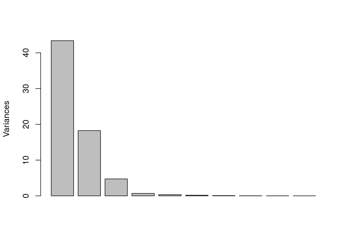
Figure 1: Scree plot from PCA on the glass data set.
Figure 1, the scree plot, shows the amount of variance in the data set explained by, in this case, each of the first 10 principal components (PCs are along the x axis, from 1 to 10).5 Variance is a measure of the spread of points around the origin of whatever coordinate system is in use. Think of it as a measure of the scattering of the samples.6 To interpret this plot, we look for the point at which the height of the bars suddenly levels off. In this case, the first three PCs drop steadily downward, but from PC four and onward there is little additional variance that can be explained. We would say that three PCs are enough to explain this data set. In other words, the original 13 variables have been reduced to three, which is a great simplification.
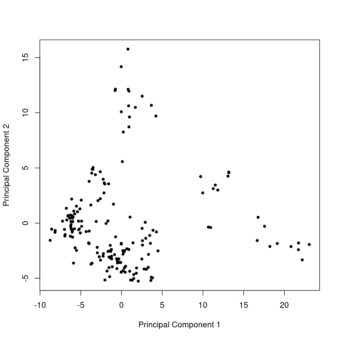
Figure 2: Score plot from PCA on the glass data set.
In Figure 2 one sees the scores for PC 1 plotted against the scores for PC 2. There are 180 points in this plot because there is one point per sample (put another way, every sample has a score value for PC 1 and for PC 2). This plot is interpreted by looking for clustering of samples, as well as for samples that are outliers, off by themselves. To our eyes there are 3 to 5 clusters here; none of the samples is an obvious outlier. Later we’ll discuss how we can explore this further.
We could also plot PC 1 against PC 3, or PC 2 against PC 3. These might show different clustering and separation of samples, but are not shown here. There wouldn’t be much point in plotting PC 4 or higher, as these are mostly noise, as established by the scree plot (Figure 1).
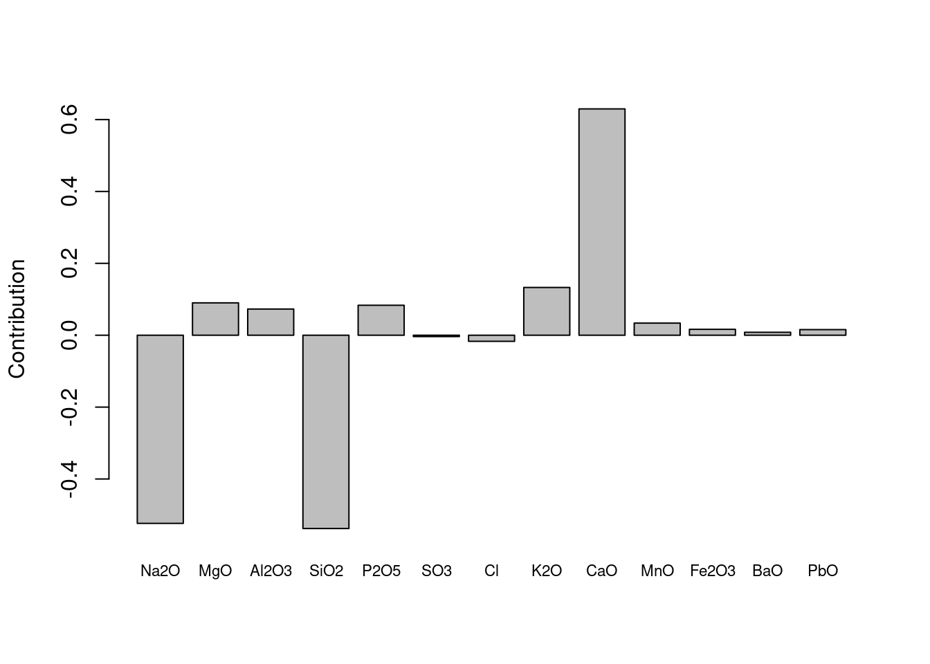
Figure 3: Loadings plot for PC 1 from PCA on the glass data set.
A loadings plot, Figure 3, shows how much each measured variable contributes to one of the principal components and hence the separation of samples (in this case we show the loadings for PC 1). We see that three elements have large loadings, and the other elements contribute little to the separation. We would say separation along PC 1 is driven largely and collectively by the results for Na2O, SiO2 and CaO, which are the most abundant elements in most glasses.7 The first PC should be interpreted as a composite of these variables – these variables have been collapsed into one new variable, PC 1.
This ability to collapse correlated variables is a key part of PCA. Table 2 shows the correlations between these elements in the raw glass data set. We can see that the correlation between Na2O and SiO2 is positive, but the correlation between either of these elements and CaO is negative. The loading plot, Figure 3 reflects this: Na2O and SiO2 contribute in the opposite direction to CaO.8
| Na2O | SiO2 | CaO | |
|---|---|---|---|
| Na2O | 1.00 | 0.45 | -0.58 |
| SiO2 | 0.45 | 1.00 | -0.89 |
| CaO | -0.58 | -0.89 | 1.00 |
Refinements 1
Rather than relying on a scree plot to determine the number of PCs that are important, we can present the same information in a table, see Table 3. A general rule of thumb says to keep enough PCs to account for 95% of the variance. The table leads us to the same conclusion as the scree plot: keep three PCs.
| component | variance | cumulative |
|---|---|---|
| PC 1 | 64 | 64 |
| PC 2 | 27 | 91 |
| PC 3 | 7 | 98 |
| PC 4 | 1 | 99 |
| PC 5 | 0 | 100 |
| PC 6 | 0 | 100 |
| PC 7 | 0 | 100 |
| PC 8 | 0 | 100 |
| PC 9 | 0 | 100 |
| PC 10 | 0 | 100 |
| PC 11 | 0 | 100 |
| PC 12 | 0 | 100 |
| PC 13 | 0 | 100 |
Refinements 2
The mathematics of PCA do not take into account anything about the samples other than the measured variables. However, the researcher may well know something about the samples, for instance, they may fall into groups based on their origin. If this is the case, the points on the score plot can be colored according to the group. This may aid significantly in the interpretation. Lucky for us, we can do this for the glass data set. The samples are known to come from four separate sites. We’ll re-do the score plot with colors corresponding to the known groups (Figure 4).
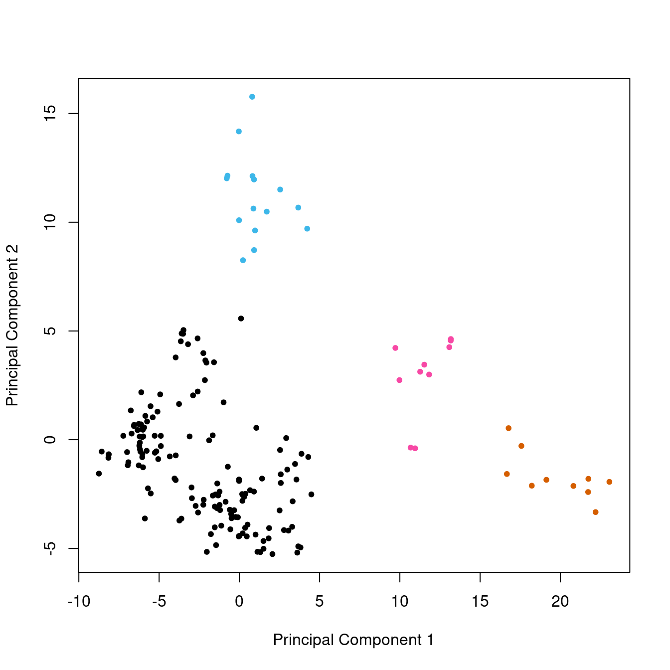
Figure 4: Score plot from PCA on the glass data set, with groups color-coded.
With this figure, we can see that the large group in the lower left corner (in black), which to our eyes might have been two groups, is composed of related samples.
A Social Science Data Set
Because it is often easiest to learn from examples close to one’s field of interest, we’ll do the same kind of analysis as above using the state data set which is supplied with R. More precisely, we’ll use the data in the state.x77 field which gives some data about each state from the year 1977. Table 4 summarizes the raw data by reporting the smallest and largest result for each variable. See ?state for more information about this data set.
| Population | Income | Illiteracy | Life Exp | Murder | HS Grad | Frost | Area |
|---|---|---|---|---|---|---|---|
| 365 | 3098 | 0.5 | 67.96 | 1.4 | 37.8 | 0 | 1049 |
| 21198 | 6315 | 2.8 | 73.60 | 15.1 | 67.3 | 188 | 566432 |
Let’s conduct PCA on this data set (with scaling, because the ranges of the variables differ quite a bit; don’t sweat it right now but see Step By Step PCA for more details). Figure 5 shows the scree plot. Clearly one PC is really important, but perhaps four PCs should be kept. If we look at the actual numbers they suggest five or six PCs would be better, using the 95% rule (Table 5).
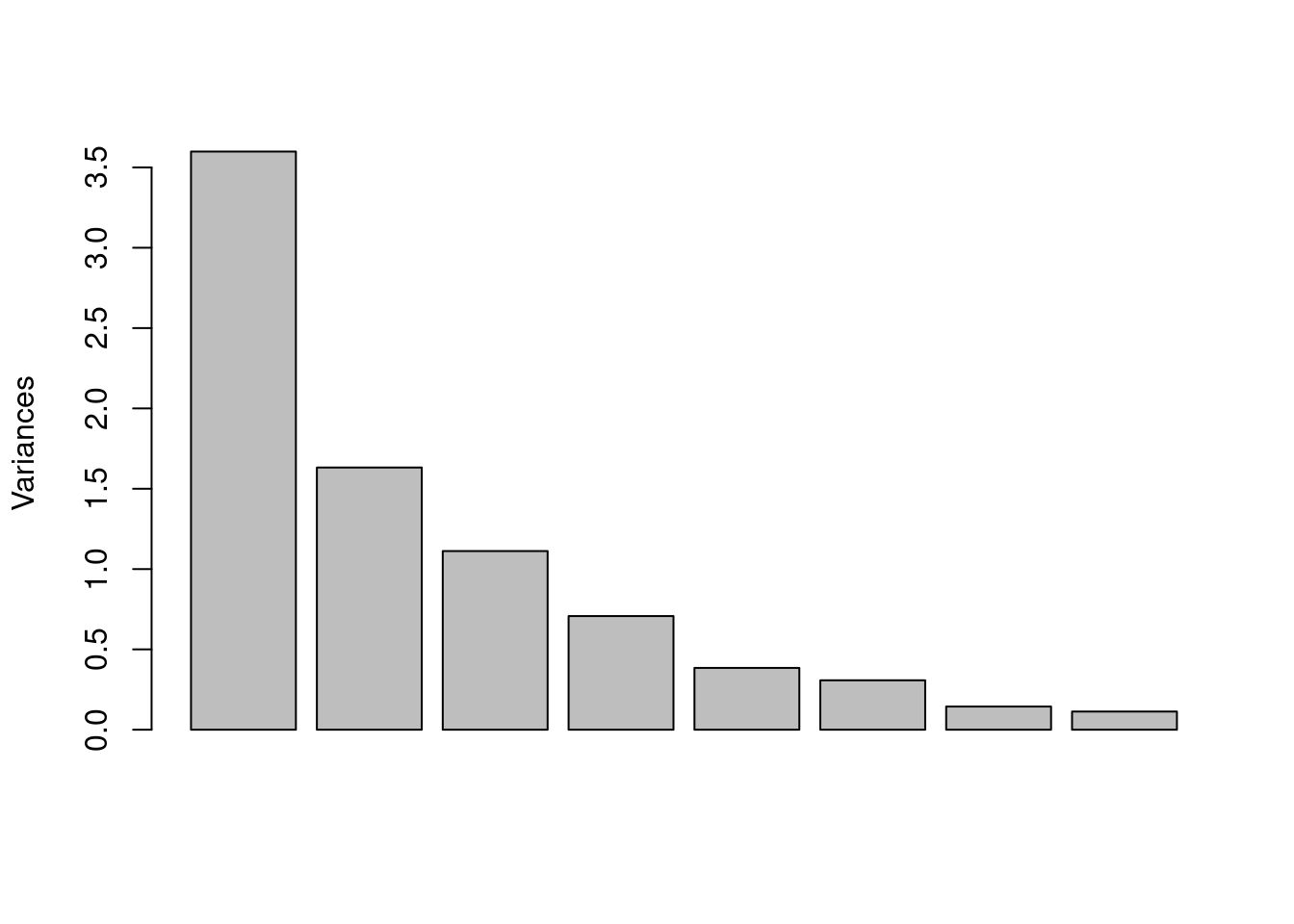
Figure 5: Scree plot for the state.x77 data after scaling.
| component | variance | cumulative |
|---|---|---|
| PC 1 | 45 | 45 |
| PC 2 | 20 | 65 |
| PC 3 | 14 | 79 |
| PC 4 | 9 | 88 |
| PC 5 | 5 | 93 |
| PC 6 | 4 | 97 |
| PC 7 | 2 | 99 |
| PC 8 | 1 | 100 |
The score plot for this data set is shown in Figure 6. For fun, we have colored the states by their blue (democrat)/red (repubican) classification based on data at Wikipedia (this classification is from presidential elections in 2008-2020 which doesn’t match the data from 1977, but we’re just having fun here trying to get the basic idea). There are no obvious clusters in this plot.
We can see a great deal of separation occurs along the PC1 dimension, consistent with this component explaining 45% of the variance. PC2 on the other hand has a similar overall span, but most of the scores are concentrated in the lower part of the plot. We can see there are a couple of states with high scores on PC2. This is an illustration of another use of PCA which we have not discussed yet, namely the identification of potentially anomolous data, or outliers. Such points are worthy of further investigation; they might be interesting clues or they might arise from data entry problems.
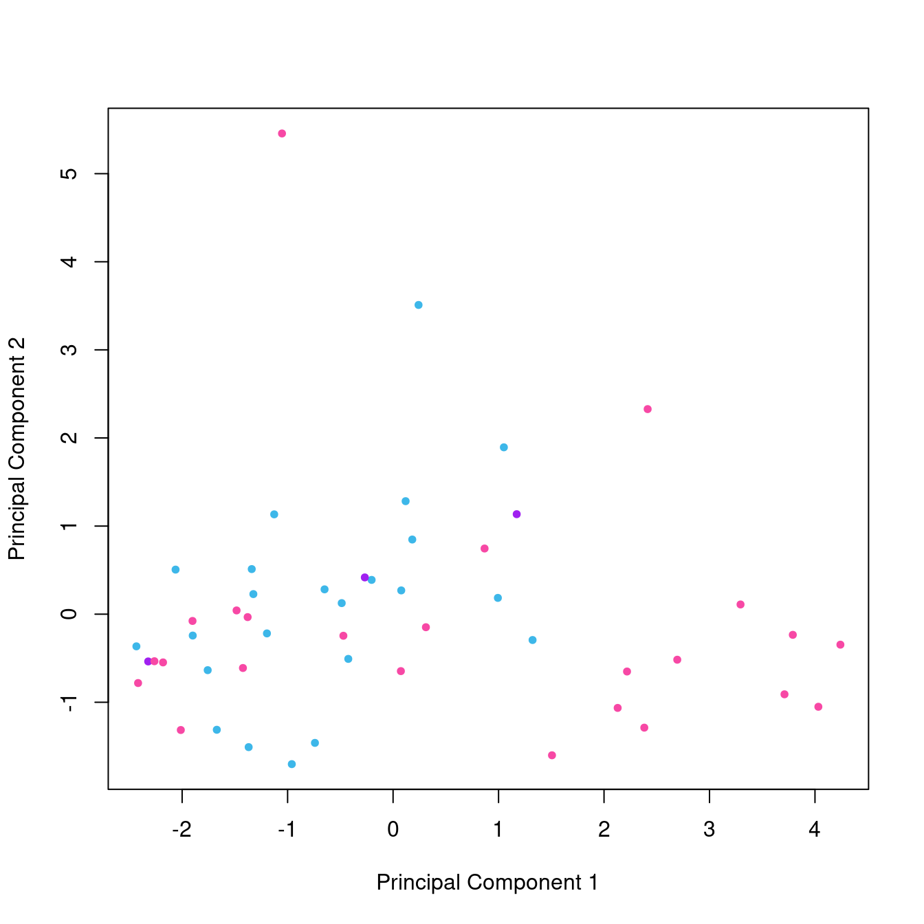
Figure 6: Score plot from PCA on the states.x77 data set, colored by political leanings (ligth blue = democrat, pink = republican, purple = mixed).
Finally, the loadings for PC1 are shown in Figure 7. The contribution of variables here is complicated, but it looks like area is not very helpful.
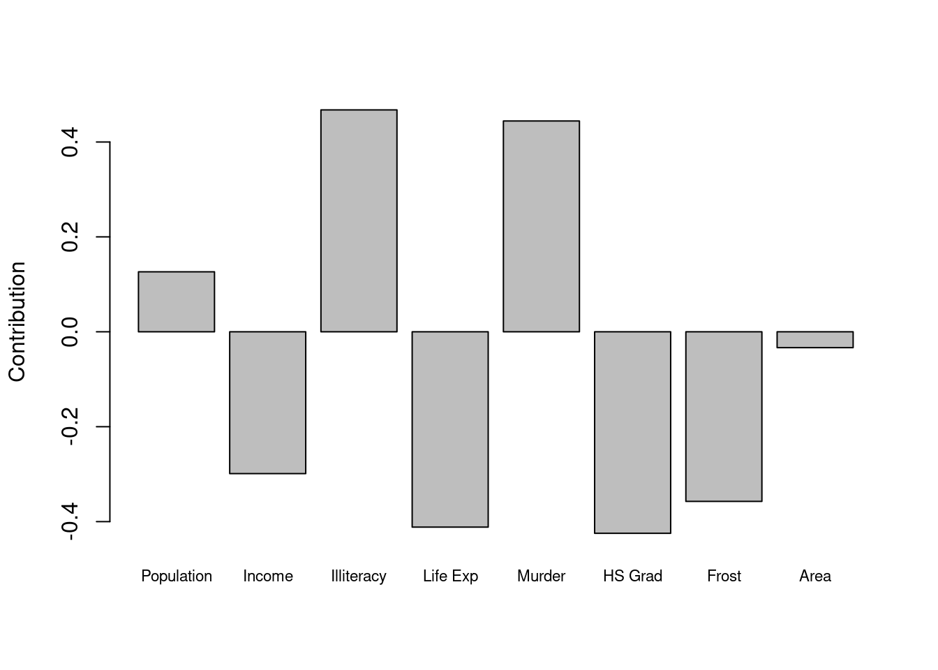
Figure 7: Loadings plot for PC 1 from PCA on the state.x77 data set.
A Spectroscopic Data Set
The archaeological glass data set has the advantage of only having a few variables, the percentages of the 13 elements in the glass artifacts. If we move to a spectroscopic data set, the number of variables goes up dramatically. A UV-Vis data set typically would have a few hundred to a thousand wavelength variables, an IR data set perhaps a few thousand data points, and a 1D NMR data set would typically have 16K or more data points. As far as PCA is concerned, in these cases the scree plot and score plot do not change in appearance or interpretation.
However, the loading plot changes appearance dramatically. This is because with hundreds to thousands of variables, one would not create a loading plot based on a bar chart (Figure 3 is a bar chart). Instead, the loading plot with many variables looks like a spectrum! While the appearance is different, the interpretation is the same as for when there are only a few variables.
Let’s illustrate with an IR data set. We’ll use a data set included with the ChemoSpec package. This is a set of IR spectra of plant oils which are mixtures of triglycerides (also called triacylglyerols, which are esters of fatty acids), and free fatty acids. Figure 8 shows a typical spectrum from the data set.9
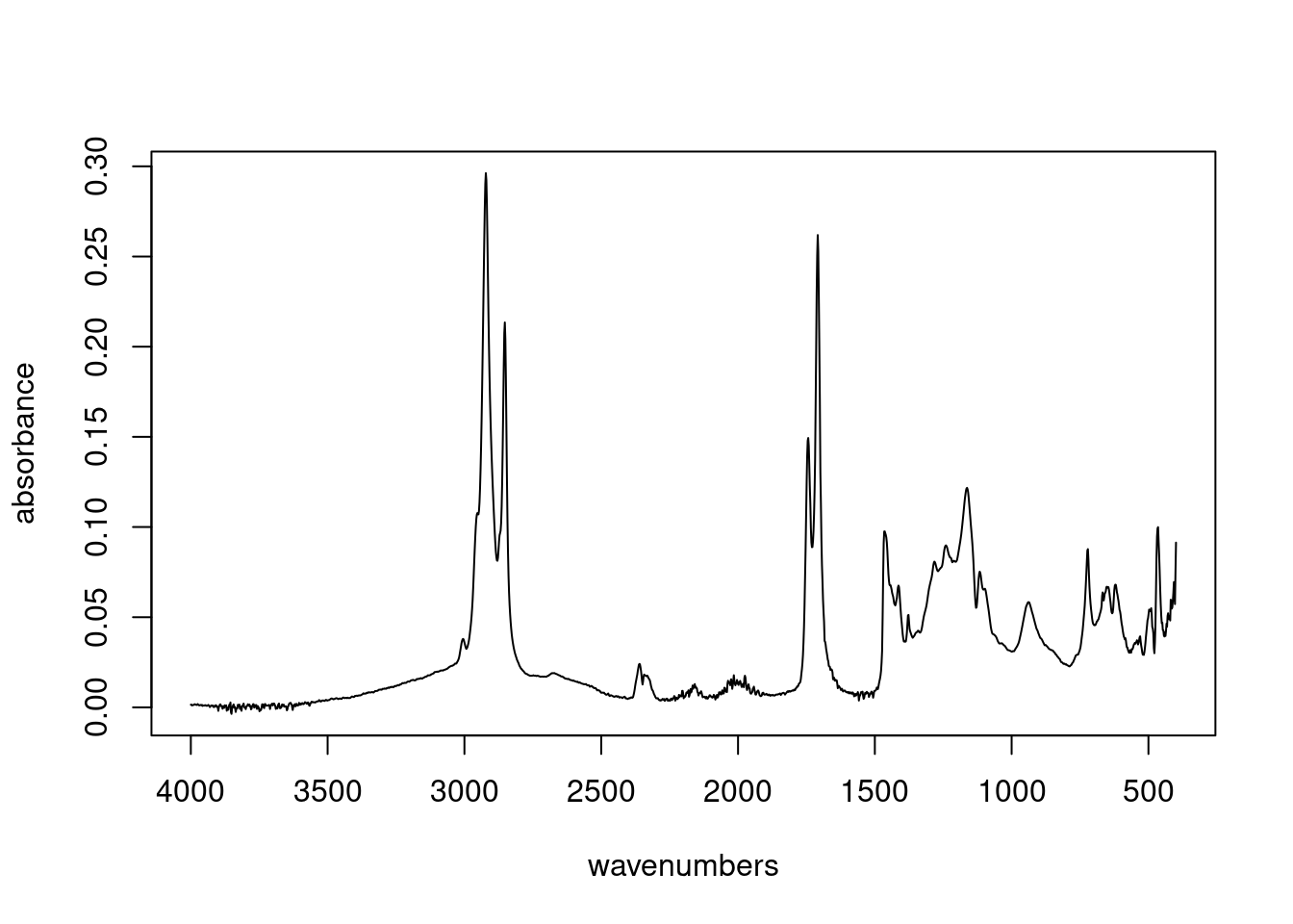
Figure 8: Spectrum 1 from the IR data set.
Next, we’ll carry out PCA as before, and show the scree plot (Figure 9) and the score plot (Figure 10). These appear much like the corresponding plots for the glass data set, and are interpreted in the same manner. In this case however, PC1 is pretty much all that is needed to understand the data set, a fact reflected in the scree plot and the comparatively small range of the scores along PC2 in the score plot.
However, the loadings plot, Figure 11, looks a lot like a spectrum, because it has 1868 data points with a meaningful order—an organized set of wavenumbers—and is plotted as a connected scatter plot and not as a bar chart (which would be very difficult to read).
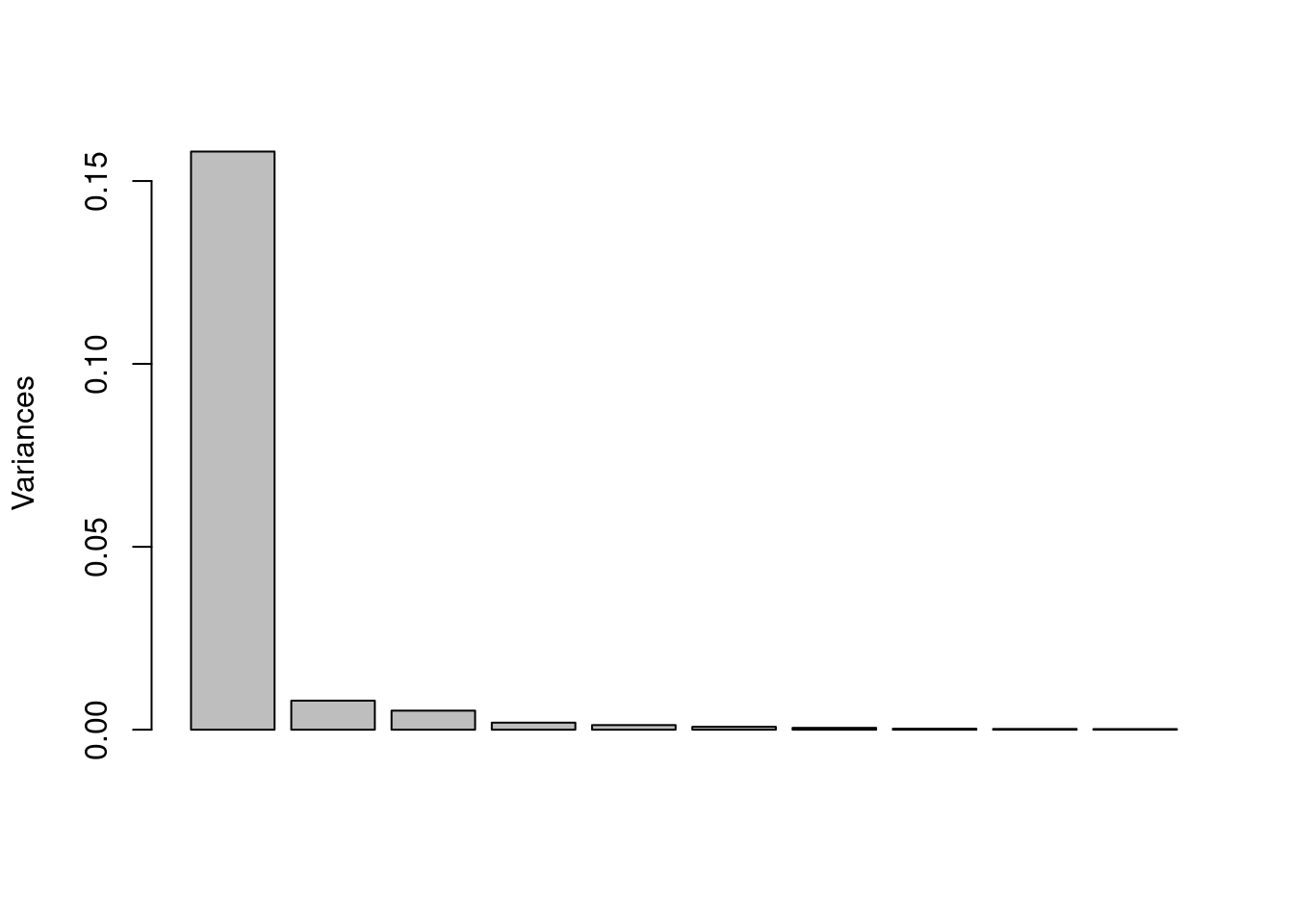
Figure 9: Scree plot from PCA on the IR data set.
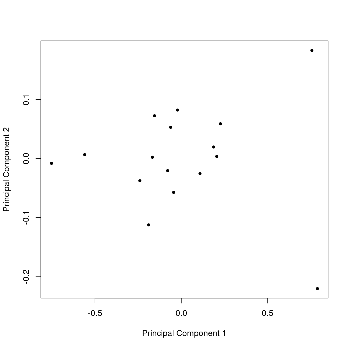
Figure 10: Score plot from PCA on the IR data set.
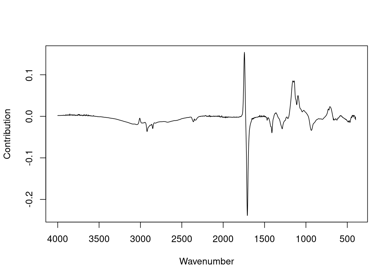
Figure 11: Loadings plot for PC 1 from PCA on the IR data set.
Let’s zoom in on the carbonyl region of the loadings plot in detail. This region shows the contributions of various C=O (carbonyl) bonds in the structure. Figure 12 shows the original spectrum in red, for reference, and the loadings in black. One can see that the ester carbonyl peak around 1745 contributes positively to the first loading, while the carboxylic acid carbonyl peak at about 1705 contributes negatively.
Finally, to make the point that the loading plot for many variables is really the same as the loading plot for just a few variables, Figure 13 shows the carbonyl loadings as a bar plot with super narrow bars. If one connects the tips of the bars together, one gets the previous plot.10
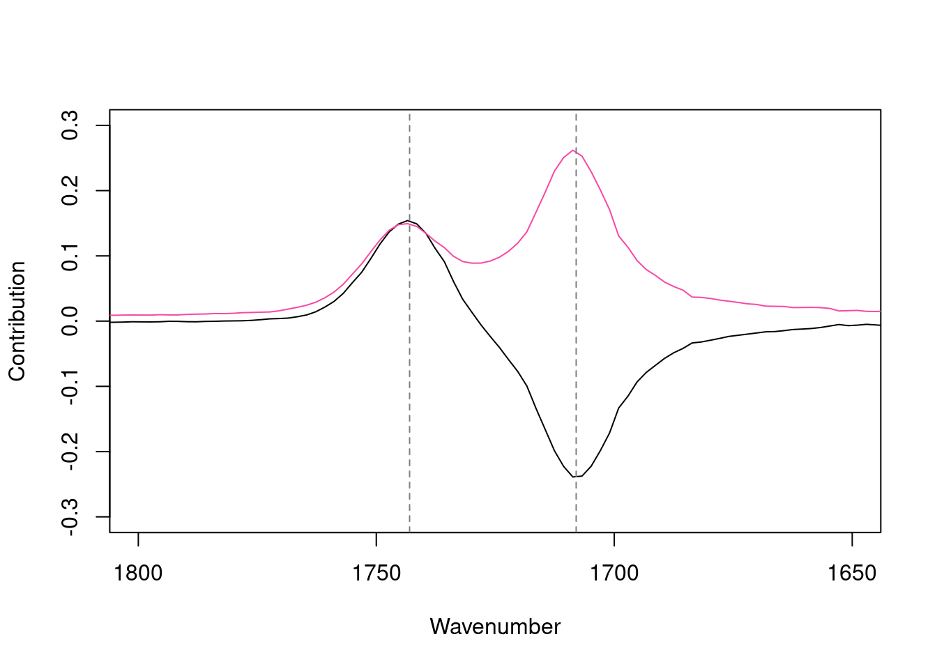
Figure 12: Loadings plot for PC 1 from PCA on the IR data set, carbonyl region. Reference spectrum shown in red.
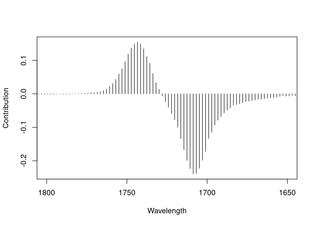
Figure 13: Loadings plot for PC 1 from PCA on the IR data set, carbonyl region, shown as a bar plot.
Works Consulted
In addition to references and links in this document, please see the Works Consulted section of the Start Here vignette for general background.
Professor of Chemistry & Biochemistry, DePauw University, Greencastle IN USA., harvey@depauw.edu↩︎
Professor Emeritus of Chemistry & Biochemistry, DePauw University, Greencastle IN USA., hanson@depauw.edu↩︎
There is another plot, the “biplot”, which is sometimes encountered. This plot will be dealt with in a separate document.↩︎
This is the
glassdata set in packagechemometrics. The elements analyzed were Na2O, MgO, Al2O3, SiO2, P2O5, SO3, Cl, K2O, CaO, MnO, Fe2O3, BaO, and PbO. With the exception of chlorine, the elements are reported as their oxides; all values are weight percents.↩︎Because there are 13 variables, the most PCs one could have is 13. In theory, keeping all 13 PCs perfectly reproduces the original data set.↩︎
If the coordinate system is well-chosen, then the spead of points along an axis represents signal rather than noise.↩︎
If you knew this would be the result ahead of time, you probably would not have taken the time and expense to analyze the uninformative elements. However, we haven’t looked at PC 2 or PC 3 so this conclusion is premature.↩︎
If one were to look at the correlations between all the elements in the
glassdata set, one would find that other elements correlate positively with Na2O, not just SiO2. However, what PCA has done here is found the unique pattern of these three elements tracking each other in the new coordinate system, as seen in the loading plot.↩︎Plots in this vignette are deliberately made rather plain to focus on the data and to be consistent for ease-of-comparison. If spectroscopy is your thing, package
ChemoSpecmakes much more polished plots.↩︎One can also see here that the individual frequencies making up a peak are highly correlated, as they rise and fall together.↩︎