Step-by-Step PCA
David T. Harvey1
Bryan A. Hanson2
2024-04-26
Source:vignettes/Vig_03_Step_By_Step_PCA.Rmd
Vig_03_Step_By_Step_PCA.RmdThis vignette is based upon LearnPCA version 0.3.4.
LearnPCA provides the following vignettes:
- Start Here
- A Conceptual Introduction to PCA
- Step By Step PCA
- Understanding Scores & Loadings
- Visualizing PCA in 3D
- The Math Behind PCA
- PCA Functions
- Notes
- To access the vignettes with
R, simply typebrowseVignettes("LearnPCA")to get a clickable list in a browser window.
Vignettes are available in both pdf (on CRAN) and html formats (at Github).
In this vignette we’ll walk through the computational and mathematical steps needed to carry out PCA. If you are not familiar with PCA from a conceptual point of view, we strongly recommend you read the Conceptual Introduction to PCA vignette before proceeding.
The steps to carry out PCA are:
- Center the data
- Optionally, scale the data
- Carry out data reduction
- Optionally, undo any scaling, likely using a limited number of PCs
- Optionally, undo the centering, likely using a limited number of PCs
We’ll discuss each of these steps in order. For many or most types of analysis, one would just do the first three steps, which provides the scores and loadings that are usually the main result of interest. In some cases, it is desirable to reconstruct the original data from the reduced data set. For that task you needs steps four and five.
To illustrate the process, we’ll use a portion of a data set containing measurements of metal pollutants in the estuary shared by the Tinto and Odiel rivers in southwest Spain. The full data set is found in the package ade4; we’ll use data for just a couple of elements and a few samples. This 16 sample, two variable data set will make it easier to visualize the steps as we go. Table 1 shows the values, and we’ll refer to this as the FeCu data set (since we are using the data for iron and copper). It’s important at this point to remember that the samples are in rows, and the variables are in columns. Also, notice that the values for Fe2O3 are in percentages, but the values for Cu are in ppm (parts per million).
Figure 1 is a plot showing the range of the values; Figure 2 gives another view of the same data, plotting the concentrations of copper against iron.
data(tintoodiel) # activate the data set from package ade4
TO <- tintoodiel$tab # to save typing, rename the element with the data
# select just a few samples (in rows) & variables (in columns)
FeCu <- TO[28:43,c("Fe2O3", "Cu")]
summary(FeCu)
## Fe2O3 Cu
## Min. : 7.35 Min. : 1.052
## 1st Qu.:11.61 1st Qu.: 2.192
## Median :13.05 Median :238.000
## Mean :15.38 Mean :224.496
## 3rd Qu.:18.73 3rd Qu.:356.250
## Max. :32.40 Max. :787.000| Fe2O3 | Cu |
|---|---|
| 9.50 | 594.000 |
| 7.35 | 328.000 |
| 14.99 | 1.674 |
| 18.50 | 2.990 |
| 7.72 | 402.000 |
| 13.40 | 342.000 |
| 12.40 | 1.052 |
| 11.80 | 399.000 |
| 20.60 | 3.670 |
| 19.40 | 2.250 |
| 25.60 | 2.020 |
| 32.40 | 787.000 |
| 12.00 | 238.000 |
| 11.05 | 249.000 |
| 16.60 | 1.278 |
| 12.70 | 238.000 |
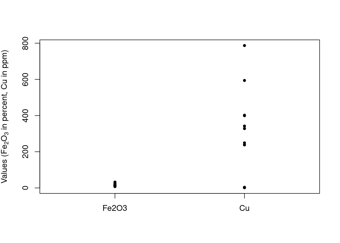
Figure 1: The range of the raw data values in FeCu.
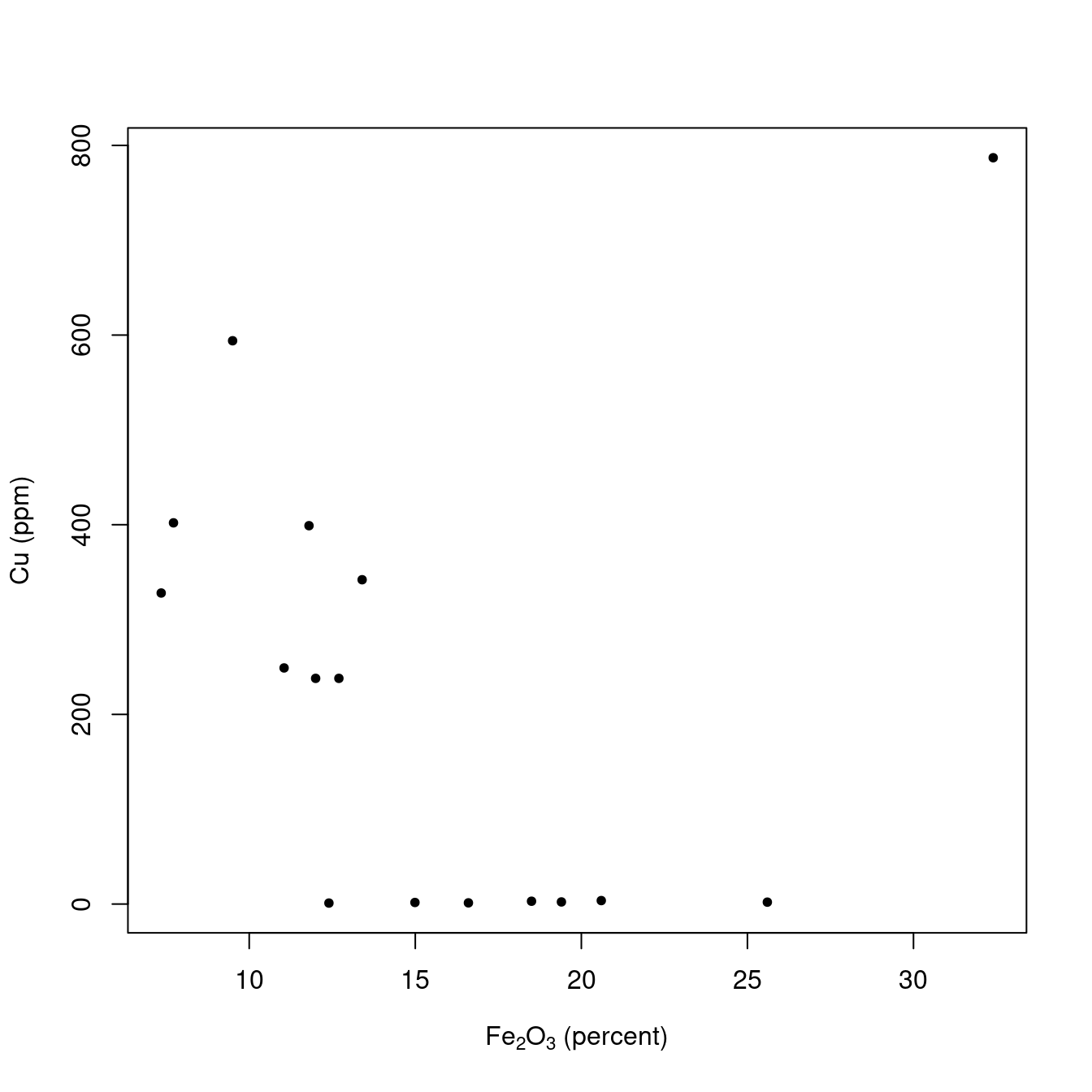
Figure 2: The relationship between the raw data values in FeCu.
Step 1. Centering the Data
The first step is to center the data.
When we center the data, we take each column, corresponding to a particular variable, and subtract the mean of that column from each value in the column. Thus, regardless of the original values in the column, the centered values are now expressed relative to the mean value for that column. The function scale can do this for us (in spite of its name, scale can both center and scale):
FeCu_centered <- scale(FeCu, scale = FALSE, center = TRUE) # see ?scale for defaultsFigure 3 is a plot of the centered values. Note how the values on the y-axis have changed compared to the raw data. It’s apparent that the ranges of the chosen variables are quite different. This is a classic case where scaling is desirable, otherwise the variable with larger values will dominate the PCA results.
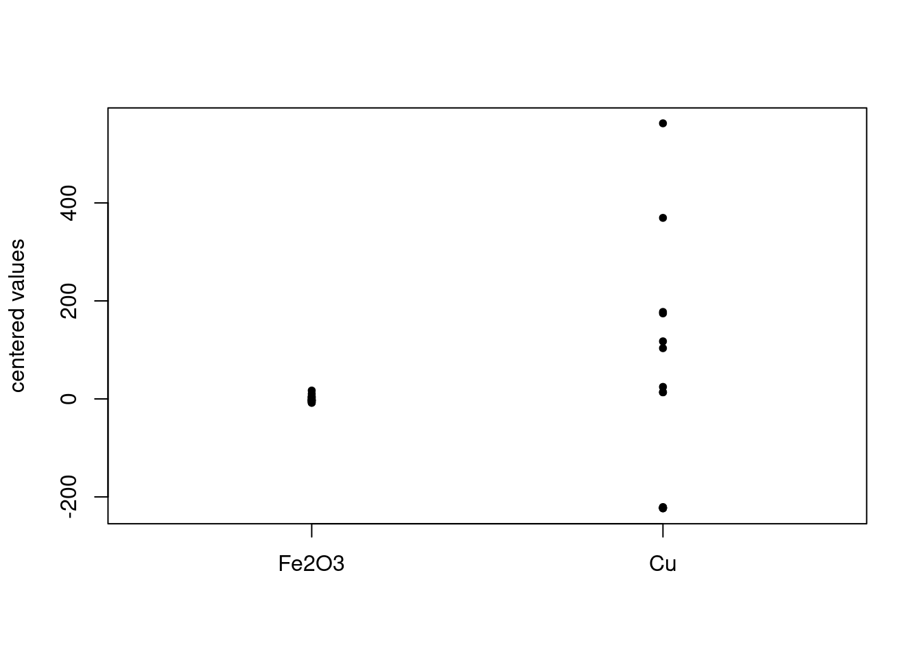
Figure 3: Centered data values in FeCu.
Why do we center the data? The easiest way to think about this is that without centering there is an offset in the data, a bit like an intercept in a linear regression. If we don’t remove this offset, it adversely affects the results and their interpretation. There is good discussion of this with illustrations at this Cross Validated answer if you wish a bit more explanation.
Step 2. Scaling the Data
Scaling the data is optional. If the range of the variables (which, recall, are in the columns) are approximately the same, one generally does not scale the data. However, if some variables have much larger ranges, they will dominate the PCA results. You may want this to happen, or you may not, and in many cases it is wise to try different scaling options. As mentioned above, the FeCu data set should be scaled to avoid the Cu values dominating the analysis, since these values are larger.3
To scale the data, we can use scale again:
FeCu_centered_scaled <- scale(FeCu_centered, center = FALSE, scale = TRUE) # see ?scale for defaultsThe default scale = TRUE scales the (already centered) columns by dividing them by their standard deviation. Figure 4 shows the result. This scaling has the effect of making the column standard deviations equal to one:
apply(FeCu_centered_scaled, 2, sd)## Fe2O3 Cu
## 1 1Put another way, all variables are now on the same scale, which is really obvious from Figure 4. One downside of this scaling is that if you have variables that may only be noise, the contribution of these variables is the same as variables representing interesting features.
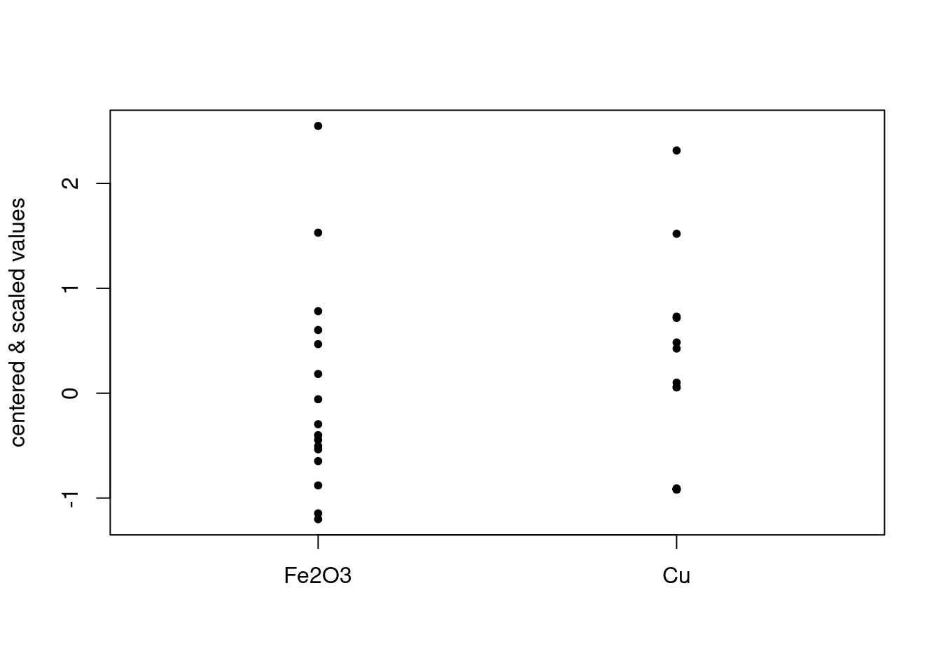
Figure 4: Centered and scaled data.
Step 3. Data Reduction
Now we are ready for the actual data reduction process. This is accomplished via the function prcomp.4 prcomp can actually do the centering and scaling for you, should you prefer. But in this case we have already done those steps, so we choose the arguments to prcomp appropriately.5
Using prcomp
## List of 5
##  $ sdev    : num [1:2] 1.007 0.992
##  $ rotation: num [1:2, 1:2] 0.707 -0.707 -0.707 -0.707
##   ..- attr(*, "dimnames")=List of 2
##   .. ..$ : chr [1:2] "Fe2O3" "Cu"
##   .. ..$ : chr [1:2] "PC1" "PC2"
##  $ center  : Named num [1:2] 1.15e-16 -6.85e-17
##   ..- attr(*, "names")= chr [1:2] "Fe2O3" "Cu"
##  $ scale   : Named num [1:2] 6.68 243.11
##   ..- attr(*, "names")= chr [1:2] "Fe2O3" "Cu"
##  $ x       : num [1:16, 1:2] -1.697 -1.15 0.607 0.975 -1.327 ...
##   ..- attr(*, "dimnames")=List of 2
##   .. ..$ : chr [1:16] "O-1" "O-2" "O-3" "O-4" ...
##   .. ..$ : chr [1:2] "PC1" "PC2"
##  - attr(*, "class")= chr "prcomp"
str(pca_FeCu) shows the structure of pca_FeCu, the object that holds the PCA results. A key part is pca_FeCu$x, which holds the scores. Notice that it has 16 rows and two columns, exactly like our original set of data. In general, pca$x will be a matrix with dimensions n \(\times\) p where n is the number of samples, and p is the number of variables.
Scores represent the original data but in a new coordinate system. Figure 5 shows the scores.
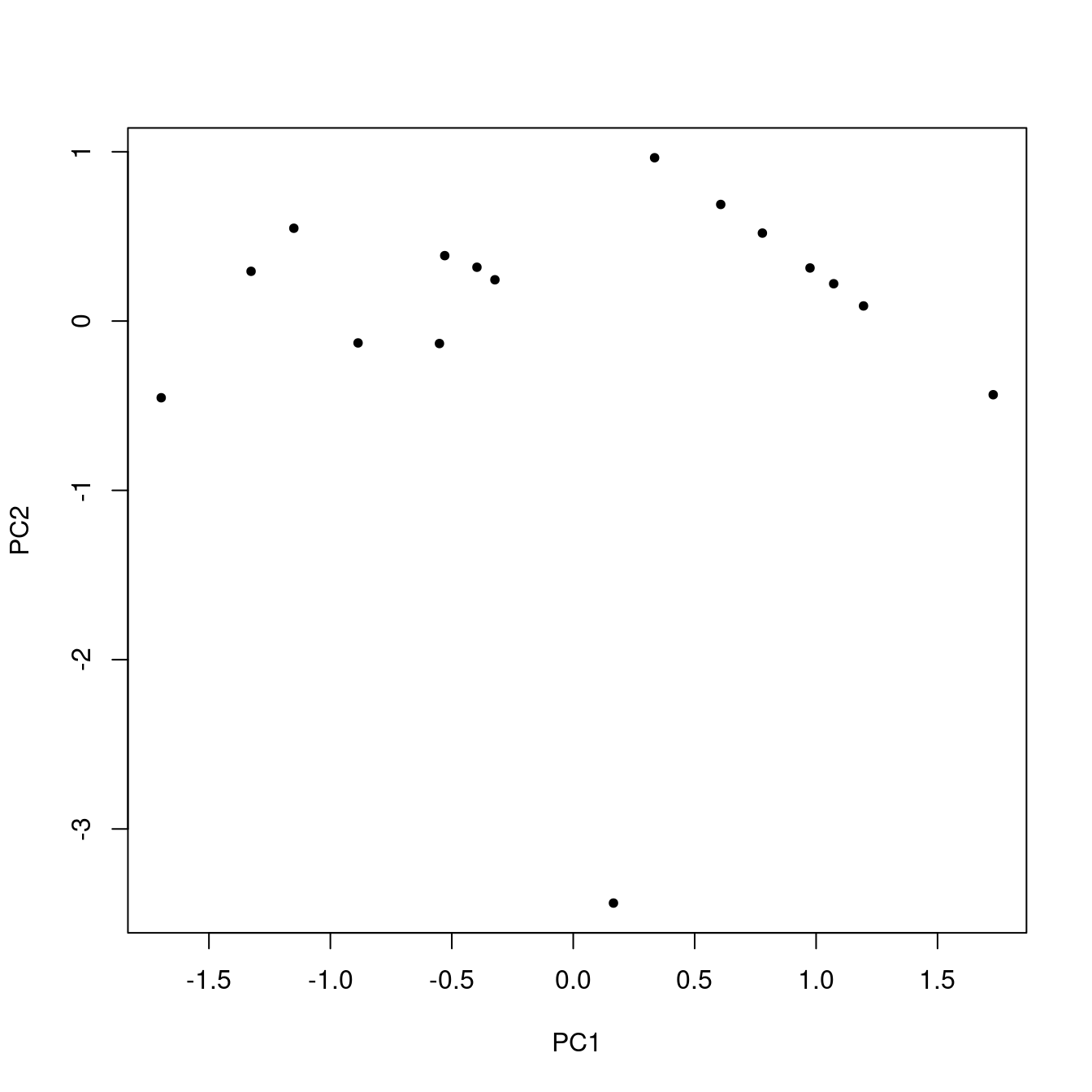
Figure 5: Scores.
Using All the Data
If you compare Figure 5 to Figure 2, it looks broadly similar, but the points are rotated and the scales are different.6 You might ask, what did we really accomplish here? Well, because we are using just a tiny portion of the original data, the multi-dimensional nature of the whole set is obscured. So, just to make the point, let’s repeat everything we’ve done so far, except use all the data (52 samples and 16 variables). Figure 6 shows the first two principal component scores. A similar plot of the raw data is not possible, because it is not two-dimensional: there are 16 dimensions corresponding to the 16 variables.7
pca_TO <- prcomp(TO, scale. = TRUE)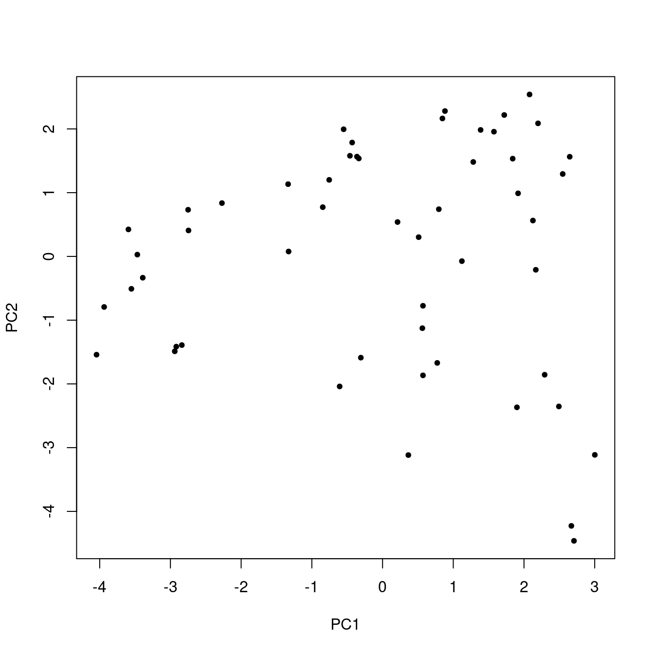
Figure 6: Score plot using all the data.
What Else is in the PCA Results?
Earlier we did str(pca) to see what was stored in the results of our PCA. We already considered pca$x. The other elements are:
-
pca$sdevThe standard deviations of the principal components. These are used in the construction of a scree plot (coming up next). The length ofpca$sdevis equal top, the number of variables in the data set. -
pca$rotationThese are the loadings, stored in a square matrix with dimensionsp\(\times\)p -
pca$centerThe values used for centering (either calculated byprcompor passed as attributes from the results ofscale). There arepvalues. -
pca$scale(either calculated byprcompor passed as attributes from the results ofscale). There arepvalues.
The returned information is sufficient to reconstruct the original data set (more on that later).
Scree Plot
As mentioned in the A Conceptual Introduction to PCA vignette, a scree plot shows the amount of variance explained for each PC. These values are simply the square of pca$sdev and can be plotted by calling plot on an object of class prcomp. See Figure 7. Remember, the more variance explained, the more information a PC carries. From the plot, we can see that both variables contribute about equally to separation in the score plot.8
plot(pca_FeCu, main = "")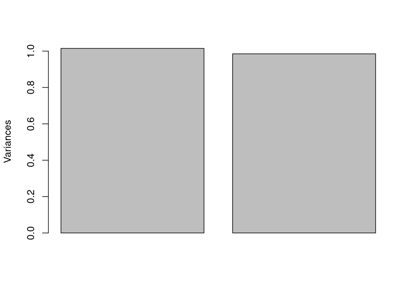
Figure 7: Scree plot.
Loading Plot
To show the loadings, one can use the following code, which gives Figure 8. We can see that the Fe2O3 and Cu contribute in opposite directions.
barplot(pca_FeCu$rotation[,1], main = "")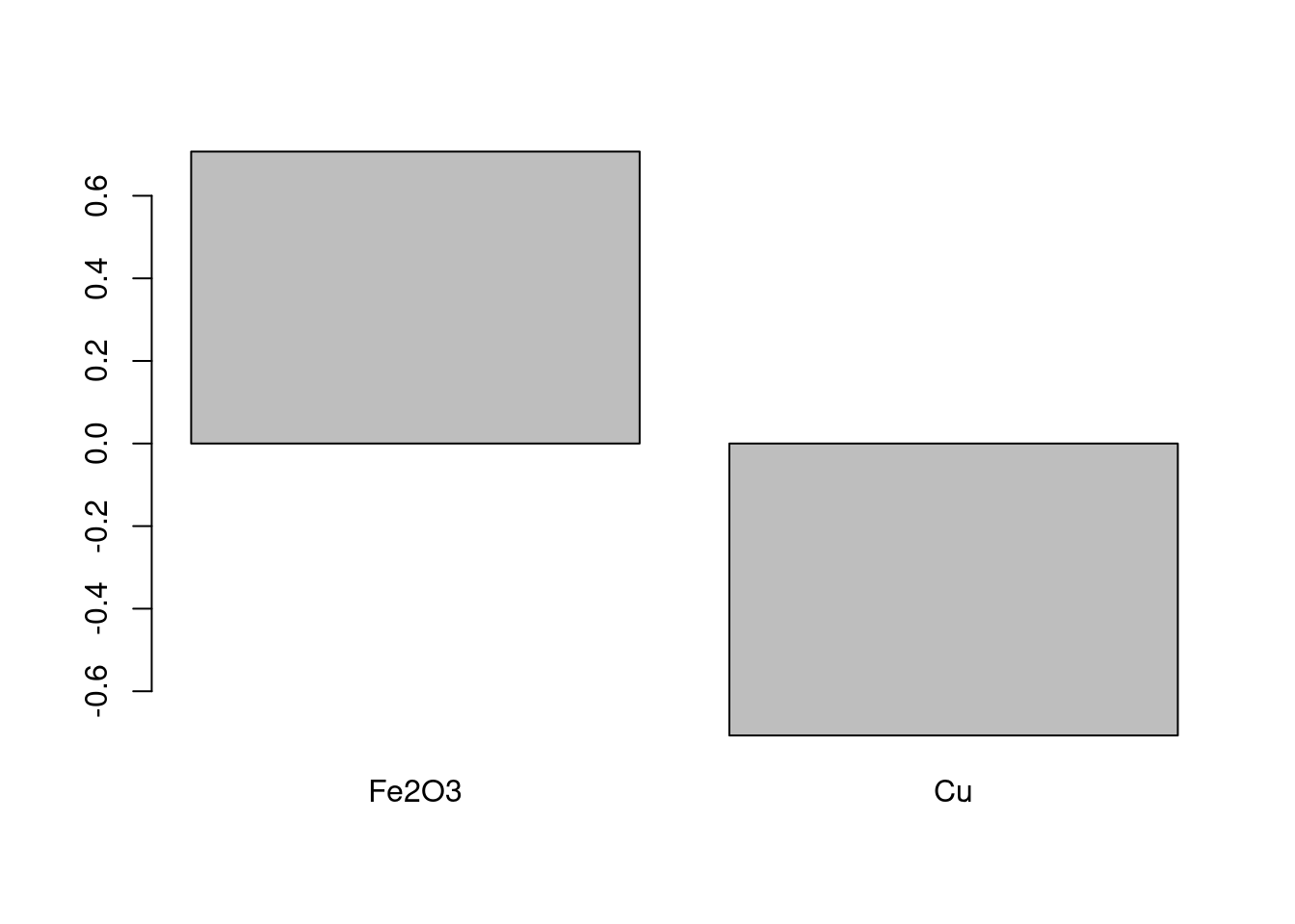
Figure 8: Plot of the loadings on PC1.
At this point we have looked at each element of a prcomp object and seen what information is stored in it.
How Does prcomp Actually Work?
Please see both the The Math Behind PCA and Understanding Scores & Loadings vignettes for a full discussion of the details of the calculation.
Step 4. Undoing the Scaling
Sometimes it is desirable to reconstruct the original data using a limited number of PCs. If one reconstructs the original data using all the PCs, one gets the original data back. However, for many data sets, the higher PCs don’t represent useful information; effectively they are noise. So using a limited number of PCs one can get back a reasonably faithful representation of the original data.
To reconstruct all or part of the original data, one starts from the object returned by prcomp. If one wants to use the first z PCs to reconstruct the data, one takes the first z scores (in pca$x) and multiplies them by the tranpose of the first z columns of the rotation matrix (in pca$rotation). In R this would be expressed for the pca_FeCu data set as:
where Xhat is the reconstructed9 original matrix.10
We are now ready to undo the scaling, which is accomplished by dividing the columns of Xhat by the scale factors previously employed. Once again the scale function makes it easy to operate on the columns of the matrix.
Xhat <- scale(Xhat, center = FALSE, scale = 1/pca_FeCu$scale)Step 5. Undoing the Centering
Finally, we take the unscaled Xhat and add back the values that we subtracted when centering, again using scale.
Xhat <- scale(Xhat, center = -pca_FeCu$center, scale = FALSE)One might think that scale can handle both the unscaling and re-centering processes at the same time. This is not the case, as scale does any (un)centering first, then scales the data. We need to take care of scaling first, and then the centering second. Thus in the forward direction, scale can handle both tasks simultaneously, but in the reconstruction direction, we need to take it step-wise.
Proof of Perfect Reconstruction
If we use only a portion of the PCs, an approximation of the original data is returned. If we use all the PCs, then the original data is reconstructed. Let’s make sure this is true for the full tintoodiel data set.
TOhat <- pca_TO$x %*% t(pca_TO$rotation)
TOhat <- scale(TOhat, center = FALSE, scale = 1/pca_TO$scale)
TOhat <- scale(TOhat, center = -pca_TO$center, scale = FALSE)
If this process worked correctly, there should be no difference between the reconstructed data and the original data.
## [1] 4.220048e-16The result is a vanishingly small number, so we’ll call it a Success!
The More Components Used, the Better the Reconstruction
Figure 9 shows how the approximation of the original data set (tintoodiel) improves as more and more PCs are included in the reconstruction. The y-axis represents the error, as the root mean squared deviation of the original data minus the approximation.
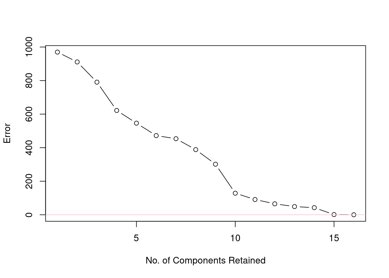
Figure 9: Reduction of error as the number of components included in the reconstruction increases.
Works Consulted
In addition to references and links in this document, please see the Works Consulted section of the Start Here vignette for general background.
Professor of Chemistry & Biochemistry, DePauw University, Greencastle IN USA., harvey@depauw.edu↩︎
Professor Emeritus of Chemistry & Biochemistry, DePauw University, Greencastle IN USA., hanson@depauw.edu↩︎
The actual numbers are what matter as far as the mathematics of scaling goes. However, in practice, one should pay attention to the units as well. For those that are not chemists, a “ppm” is a much smaller unit than a percentage. If we were to report both metal concentrations in percentages, it would make the Cu values much smaller and it is the Fe2O3 values that would dominate.↩︎
There are other functions in
Rfor carrying out PCA. See the PCA Functions vignette for the details.↩︎If one uses
scaleto center and/or scale your data, the results are tagged with attributes giving the values necessary to undo the calculation. Take a look atstr(FeCu_centered_scale)and you’ll see these attributes. Compare the values forattributes(FeCu_centered_scaled)["scaled:center"]tocolMeans(FeCu). Importantly, if you usescaleto do your centering and scaling, these attributes are understood byprcompand are reflected in the returned data, even ifprcompdidn’t do the centering and scaling itself. In other words, these two functions are designed to work together.↩︎This is an important observation that we discuss in the Understanding Scores & Loadings vignette.↩︎
For the full data set, there are also 16 dimensions in the form of 16 principal components. But, each of the 16 principal components each has a bit of the original 16 raw variables in it, and showing only the first two principal components is meaningful. How meaningful? The scree plot will tell us. Keep reading.↩︎
As an exercise, see what happens to the scree plot if you don’t scale the values.↩︎
Why do we call it
Xhat?Xrepresents the data matrix.hatis a reference to the use of the symbol \(\hat{}\) as in \(\hat{X}\) which is often used to designate a reconstruction or estimation of a value in statistics.↩︎Since there are only two columns in
FeCu, the largest value ofzthat one could us is two, which is not very interesting. Keep reading.↩︎