Visualizing PCA in 3D
David T. Harvey1
Bryan A. Hanson2
2024-04-26
Source:vignettes/Vig_05_Visualizing_PCA_3D.Rmd
Vig_05_Visualizing_PCA_3D.Rmd## Warning: no DISPLAY variable so Tk is not availableThis vignette is based upon LearnPCA version
0.3.4.
LearnPCA provides the following vignettes:
- Start Here
- A Conceptual Introduction to PCA
- Step By Step PCA
- Understanding Scores & Loadings
- Visualizing PCA in 3D
- The Math Behind PCA
- PCA Functions
- Notes
- To access the vignettes with
R, simply typebrowseVignettes("LearnPCA")to get a clickable list in a browser window.
Vignettes are available in both pdf (on CRAN) and html formats (at Github).
We strongly suggest viewing the html version of this vignette to take advantage of the interactive graphics.
One simple explanation of PCA is that it is the creation of a new set of axes, rotated relative to the original axes, that serves as a new coordinate system for understanding the relationships between the samples. The Understanding Scores & Loadings vignette illustrates this process in 2D. As the number of dimensions increases however, it becomes difficult to visualize because we are limited by our inability to see in more than three dimensions. A flock of birds that suddenly takes flight is an easy to understand description of a cloud of data in three dimensions. But what does a cloud of data look like in four (or more) dimensions? The goal of this vignette is to start with a cloud of data in three dimensions and visually explore how the shape of this cloud changes as we go through the process of completing a PCA analysis.
Visualizing The Original Data Set
The data for this vignette consists of 205 points drawn at random from within the boundaries of an ellipsoid that has a length of 30, a width of 18, and a height of 4 – think of a flattened football. Figure 1 shows the three-dimensional cloud of data as light blue points and the three axes that define the data as black lines. These axes are not the principal component axes, they are the usual x, y and z axes.
Figure 1. Three-dimensional plot of data ( light blue points) showing the x, y, and z-axes ( black lines) that represent the three measured variables.
The First Principal Component
Although the three axes in Figure 1 define the location of the individual data points in space, any other set of three mutually perpendicular axes will accomplish the same thing. Our goal is to find three specific axes such that the first axis conveys the most information about the data and the third, and final axis explains any remaining information about the data.
You might be able to guess where the first principal component axis lies if you rotate Figure 1 and look at the two-dimensional x,y-plane, the y,z-plane, and the x,z-plane. The three projections are consistent with an ellipsoid whose length is greater than its width (see the x,y-plane), and whose width is greater than its height (see y,z-plane).
For those viewing the pdf version of this vignette and thus cannot rotate the view of the original data, we offer a bonus view to help you predict where the first principal component axis will lie (if you are viewing the html version you will not see the figure). This Bonus Figure shows the same cloud of data as light blue points in three dimensions, and projections of the data, as pink points, onto the two-dimensional x,y-plane, the y,z-plane, and the x,z-plane (in other words, the data is projected onto the “walls” of the figure). The three projections are consistent with an ellipsoid whose length is greater than its width (see the x,y-plane), and whose width is greater than its height (see y,z-plane).
Let’s see how your guess about the first principal component worked out. If we run the PCA and display the first principal component axis, we see that it runs along the long axis of the data cloud. Figure 2 shows the first principal component axis relative to the three-dimensional cloud of data seen in Figure 1. The first principal component accounts for 68.5% of the variation in the data.
Figure 2. The original data (as light blue points) and the first principal component axis (as a brown line).
The Second Principal Component
To visualize the second principal component axis, we first project the data From Figure 1 onto a plane perpendicular to the first principal component axis shown in Figure 2. Figure 3 shows this where the brown line is the first principal component, the light blue box highlights a portion of the plane perpendicular to the first principal component axis, and the points in light blue are the projections of the original data from Figure 1 onto this plane. With this view we get a solid idea of where the second principal component axis will be.
Figure 3. The first principal component ( brown line) and the projection of the original data ( light blue points) onto the plane perpendicular to the first principal component (shown with a light blue boundary).
Of course we don’t need to guess! Figure 4, shows the second principal component axis as a dashed brown line. The second principal component accounts for 30.3% of the variation in the data; together, the first two principal components account for 98.8% of the variation in the data.
Figure 4. The result of adding the second principal component axis to the previous figure. The first principal component axis is the solid brown line and the second principal component axis is the dashed brown line.
The Third Principal Component
With the first two principal components in place, the last principal component is the only axis we can draw that is perpendicular to the two existing principal components. Figure 5 shows the original cloud of data and all three principal component axes. In this example, the first principal component is aligned with ellipsoid’s length, the second principal component is aligned with its width, and the third principal component is aligned with its height.
Figure 5. The original data ( light blue points) and the three three principal component axes ( brown lines). The solid line is the first principal component, the dashed line is the second principal component, and the dotted line is the third principal component.
How PCA Changes the Data Cloud
Although you can see this in the figures above, it merits additional emphasis here: the process of reducing the data to a lower dimension after we identify a principal component axis results in the data becoming more compact with less variation in the range of individual values. This is what we mean when we say that each principal component axis explains the greatest variability in the data in its current form. Figure 6 shows how the data cloud becomes smaller in size as we decrease the dimensions of the data from (a) three, to (b) two, and to (c) one dimension; panel (d) provides a closer view of panel (c), making the individual points visible. The brown lines in (a), (b), and (c) show the principal component axes at each step in the analysis.
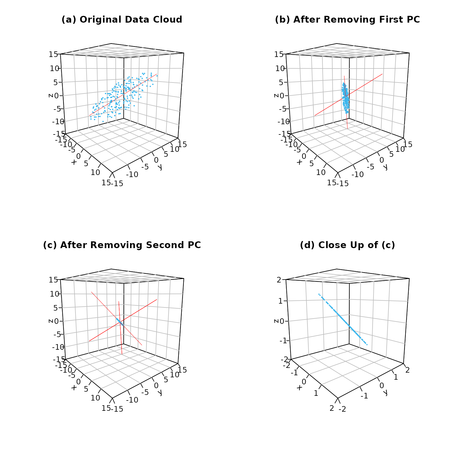
Figure 6. How the data (in light blue ) changes during PCA: (a) the original data in three dimensions; (b) the data after reducing to two dimensions; (c) the data after reducing to one dimension; (d) close up of (c) making it easier to see the individual data points. The brown lines are the principal component axes at each step in the PCA analysis.
Final Thoughts
The data sets in LearnPCA—and, more importantly, the data sets from your teaching and research projects—likely have significantly more than three variables. Although you cannot plot and examine your data set as we did here for a system with three variables, the process remains the same: rotate the coordinate system to find the principal component axis that best explains the data in n dimensions, project the data onto the \(n - 1\) dimensional surface that is perpendicular to your first principal component axis, and repeat until original set of n original axes is replaced with a set of n principal component axes.
Works Consulted
In addition to references and links in this document, please see the Works Consulted section of the Start Here vignette for general background.
Professor of Chemistry & Biochemistry, DePauw University, Greencastle IN USA., harvey@depauw.edu↩︎
Professor Emeritus of Chemistry & Biochemistry, DePauw University, Greencastle IN USA., hanson@depauw.edu↩︎