Understanding Scores and Loadings
David T. Harvey1
Bryan A. Hanson2
2024-04-26
Source:vignettes/Vig_04_Scores_Loadings.Rmd
Vig_04_Scores_Loadings.RmdThis vignette is based upon LearnPCA version 0.3.4.
LearnPCA provides the following vignettes:
- Start Here
- A Conceptual Introduction to PCA
- Step By Step PCA
- Understanding Scores & Loadings
- Visualizing PCA in 3D
- The Math Behind PCA
- PCA Functions
- Notes
- To access the vignettes with
R, simply typebrowseVignettes("LearnPCA")to get a clickable list in a browser window.
Vignettes are available in both pdf (on CRAN) and html formats (at Github).
Introduction
In the vignette A Conceptual Introduction to PCA, we used a small data set—the relative concentrations of 13 elements in 180 archaeological glass artifacts—to highlight some key features of a principal component analysis. We learned, for example, that a PCA analysis could reduce the complexity of the data from 13 variables to three, which we called the principal components. We also explored how we can use the scores returned by a PCA analysis to assign each of the 180 samples into one of four groups based on the first two principal components, and we learned how we can use the loadings from a PCA analysis to identify the relative importance of the 13 variables to each of the principal components. The vignettes The Math Behind PCA and PCA Functions explained how we extract scores and loadings from the original data and introduced the various functions within R that we can use to carry out a PCA analysis. None of these vignettes, however, explain the relationship between the original data and the scores and loadings we extract from that data by a PCA analysis. As we did in the vignette Visualizing PCA in 3D, we will use visualizations to help us understand the origin of scores and loadings.
A Small Data Set
For this vignette we will use a small data set that consists of eight samples and two variables. We are limiting ourselves to two variables so that we can plot the data in two dimensions and we are limiting ourselves to eight samples so that our plots are reasonably uncluttered and easy to view. Figure 1 shows a plot of the original data and Table 1 shows the individual values for each sample and variable.
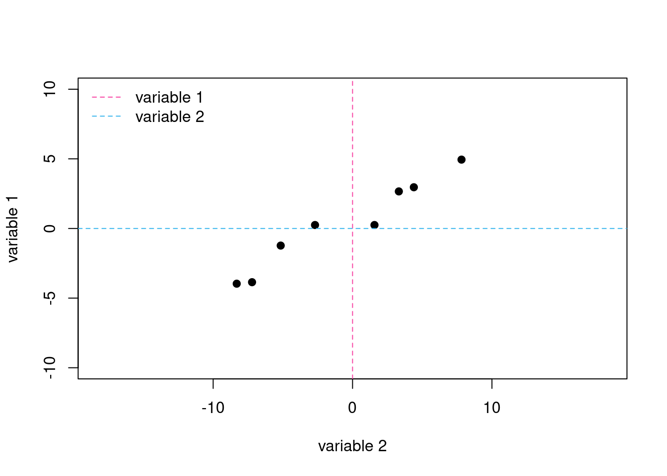
Figure 1: Scatterplot of variable 1 and variable 2 for our eight samples. The dashed lines are the original axes with variable 1 shown in pink and variable 2 shown in blue.
| sample | variable 1 | variable 2 |
|---|---|---|
| 1 | 2.66 | 3.32 |
| 2 | -1.23 | -5.15 |
| 3 | 0.25 | -2.69 |
| 4 | -3.86 | -7.21 |
| 5 | 4.94 | 7.82 |
| 6 | 0.25 | 1.57 |
| 7 | 2.96 | 4.40 |
| 8 | -3.96 | -8.31 |
A cursory examination of Figure 1 shows us that there is a positive correlation between the two variables; that is, a general increase in the value for one variable results in a general increase in the value for the other variable. As you might expect from other vignettes, this correlation between the two variables suggests that a single principal component is likely sufficient to explain the data.
Another way to examine our data is to consider the relative dispersion in the values for each variable. An examination of the data in Table 1 shows that variable 2 spans a greater range of values (from -8.31 to 7.82) than do the values for variable 1 (from -3.96 to 4.94). We can treat this quantitatively by reporting the variance3 for each variable and the total variance, which is the sum of the variances for the two variables:
variable 1’s variance: 10.29
variable 2’s variance: 34.84
total variance: 45.13
Variable 2 accounts for 77.2% of the total variance and variable 1 accounts for the remaining 22.8% of the total variance. It is important to note that these values refer to variance measured relative to the original axis system. If we change the axis system (as we will do momentarily), the variance relative to each new axis will be different because the position of the points relative to the axes are different.
Rotating the Axes
As outlined in the vignette Visualizing PCA in 3D, a principal component analysis essentially is a process of rotating our original set of \(n\) axes, which correspond to the \(n\) variables we measured, until we find a new axis that explains as much of the total variance as possible. This becomes the first principal component axis. We then project the data onto the \(n - 1\) dimensional surface that is perpendicular to this axis and repeat this process of rotation and projection until the original \(n\) axes are replaced with a new set of \(n\) principal component axes.
For a system with just two variables, this process amounts to a simple rotation of the two axes. Suppose we arbitrarily rotate the axes in Figure 1 clockwise by 20\(^\circ\) and project the data points onto the new axes. Figure 2 shows the result where the dashed lines are the original axes associated with variable 1 and variable 2, and the solid lines are the rotated axes, which we identify for now as axis A and axis B to clarify that they are not specifically associated with one of the two variables, nor with the principal components we eventually hope to find (think of axes A and B as “proposed principal components”). It is easy to see—both visually and quantitatively—that the total variance is more evenly distributed between the two rotated axes than was the case for the original two axes. Even more importantly, the variance associated with axis A has increased from 22.8% to 55.4%. One can see this graphically by looking at the span of the pink and blue projection points on each axis.
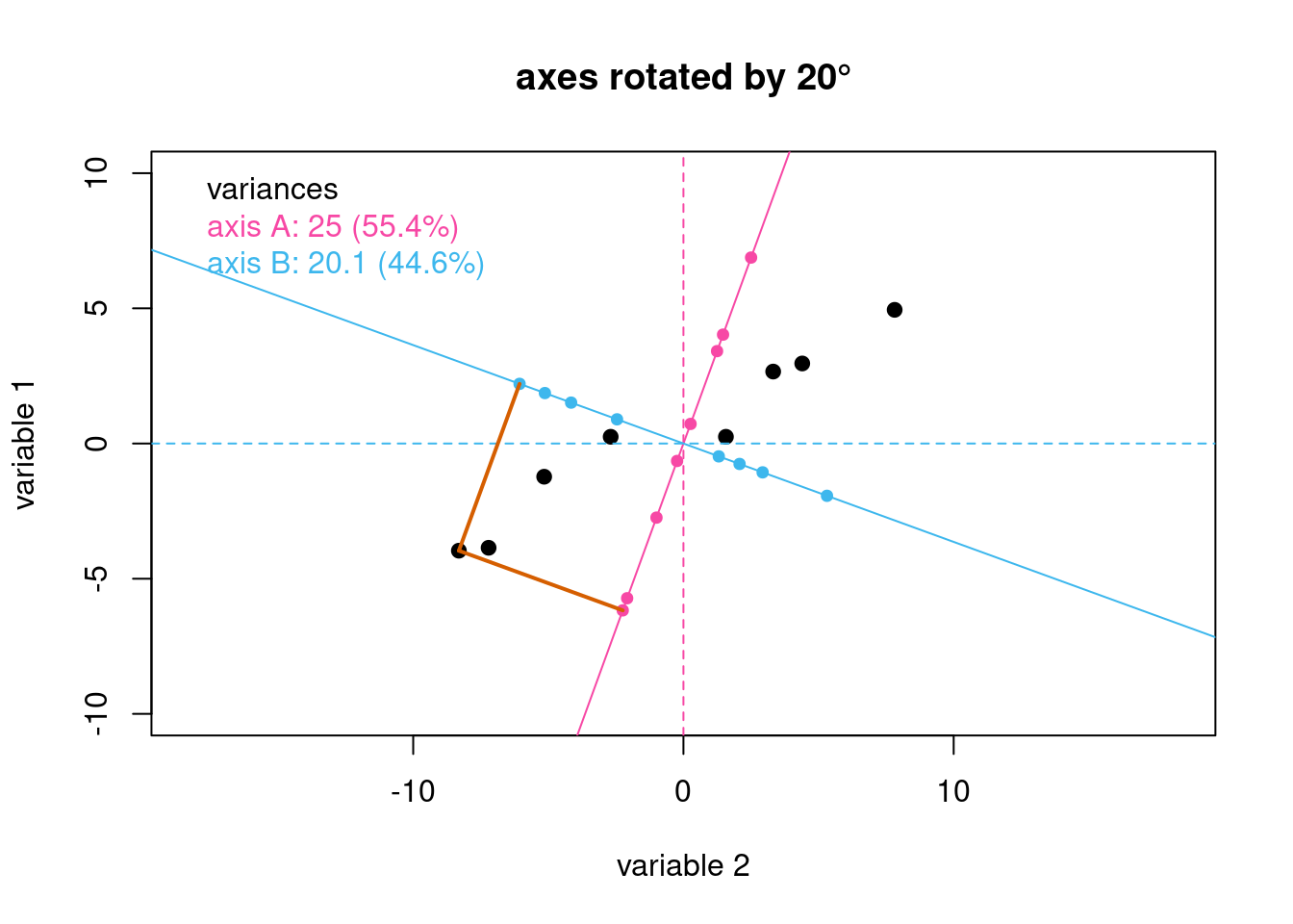
Figure 2: Rotating the original axes by 20\(^\circ\) gives the axes shown as solid lines. The small points in pink and in blue are the projections of the original data onto the rotated axes. The gray lines serve as a guide to illustrate the projections for one data point.
If we continue to rotate the axes, we discover that an angle of rotation of 60\(^\circ\) yields an axis (axis A) that explains almost 99% of the total variance in our eight samples. At this point we have maximized the variance for this axis, because further rotation will reduce the variance. As a result, we can now call this axis the first principal component axis. The remaining axis, which is perpendicular to the first principal component axis, is the second principal component axis.4
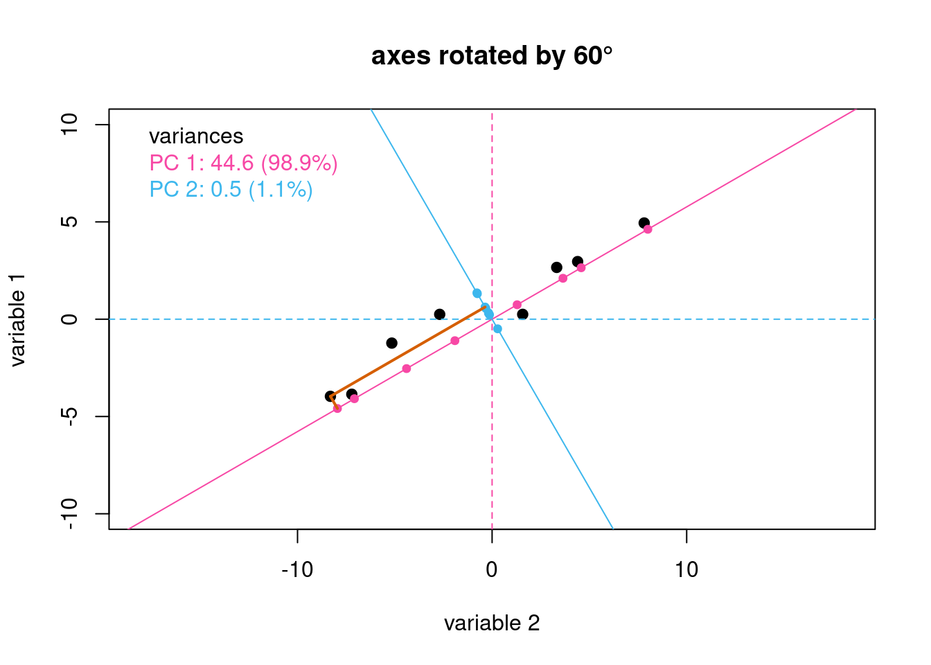
Figure 3: Rotating the original axes by 60\(^\circ\) maximizes the variance along one of the two rotated axes; the line in pink is the first principal component axis and the line in blue is the second principal component axis. The gray lines serve as a guide to illustrate the projections for one data point.
If you would like to further explore the interplay of the data, the rotation of the proposed axes and the variance, please try the shiny app by running PCsearch().
Scores
In Figure 1, each or our eight samples appears as a point in space defined by its position along the original axes for variable 1 and variable 2. After completing the rotation of the axes, each of the eight samples now appears as a point in space defined by its position along the recently discovered two principal component axes. These coordinates are the scores returned by the PCA analysis. Table 2 provides the scores for our eight samples in the columns labeled PC 1 and PC 2; also shown are the values for variable 1 and variable 2.
| sample | variable 1 | variable 2 | PC 1 | PC 2 |
|---|---|---|---|---|
| 1 | 2.66 | 3.32 | 4.21 | -0.64 |
| 2 | -1.23 | -5.15 | -5.08 | -1.51 |
| 3 | 0.25 | -2.69 | -2.21 | -1.56 |
| 4 | -3.86 | -7.21 | -8.17 | -0.27 |
| 5 | 4.94 | 7.82 | 9.24 | -0.37 |
| 6 | 0.25 | 1.57 | 1.49 | 0.57 |
| 7 | 2.96 | 4.40 | 5.29 | -0.37 |
| 8 | -3.96 | -8.31 | -9.18 | -0.72 |
| % variance | 22.80 | 77.20 | 98.93 | 1.07 |
Loadings
Although the scores define the location of our samples in the coordinates of the newly discovered principal component axes, they do not tell us where these new axes are located. If we want to reconstruct the original data from the results of a PCA analysis (a process described in more detail in the vignette Step-by-Step PCA), we must know both where the samples lie relative to the principal component axes and the location of the principal component axes relative to the original axes. As shown in Figure 4, each principal component axis is defined by the cosine of its angle of rotation relative to each of the original axes. For example, the angle of rotation of PC 1 to the axis for variable 1, identified here as \(\Theta\), is –60\(^\circ\), which gives its loading as \(\cos(-60) = 0.500\).5 The angle of rotation of PC 1 to the axis for variable 2, or \(\Phi\), returns a loading of \(\cos(30) = 0.866\).6
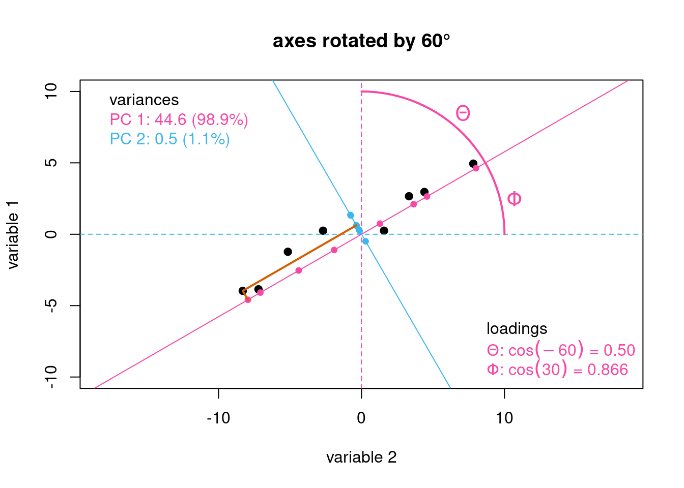
Figure 4: Illustration showing the loadings for the first principal component axis.
Since individual loadings are defined by a cosine function, they are limited to the range –1 (an angle of rotation of 180\(^\circ\)) to +1 (an angle of rotation of 0\(^\circ\)).7 The sign of the loading indicates how a variable contributes to the principal component. A positive loading indicates that a variable contributes to some degree to the principal component, and a negative loading indicates that its absence contributes to some degree to the principal component. The larger a loading’s relative magnitude, the more important is its presence or absence to the principal component.
Works Consulted
In addition to references and links in this document, please see the Works Consulted section of the Start Here vignette for general background.
Professor of Chemistry & Biochemistry, DePauw University, Greencastle IN USA., harvey@depauw.edu↩︎
Professor Emeritus of Chemistry & Biochemistry, DePauw University, Greencastle IN USA., hanson@depauw.edu↩︎
Variance is defined as \[\frac{\sum({x_i - \bar{x}})^2}{n - 1}\] for a set of \(n\) values of \(x\).↩︎
When the axis is optimally aligned with the data, the maximum variance is explained. Ideally, the spread of data long this axis represents to a high degree the phenomenon under study. Put another way, it represents the signal of interest. You can look at PCA as optimizing the signal to noise ratio along the first principal component axis, with less signal and more noise along the second principal component axis, and so on with each succeeding axis. This is reflected in the scree plot.↩︎
The optimal angle for this data set is actually 62\(^\circ\), but we’ll use the rounded value for discussion.↩︎
At this point one should ask which of these two options is the correct one? Should we take our loading to be relative to the variable 1 axis, or the variable 2 axis? It doesn’t really matter, as long as once we make the choice the rest of the computations are relative to the same choice. This is related to the fact that the signs of the loadings can change between programs and builds, discussed further in the PCA Functions vignette.↩︎
And it follows if the principal component axis aligns with an original axis, the loading will be \(\cos(0) = 1.00\), and if it is perpendicular, the loading will be \(\cos(90) = 0.00\).↩︎